Sonntag, 16. Dezember 2012

Exhibits 28, 29, 30


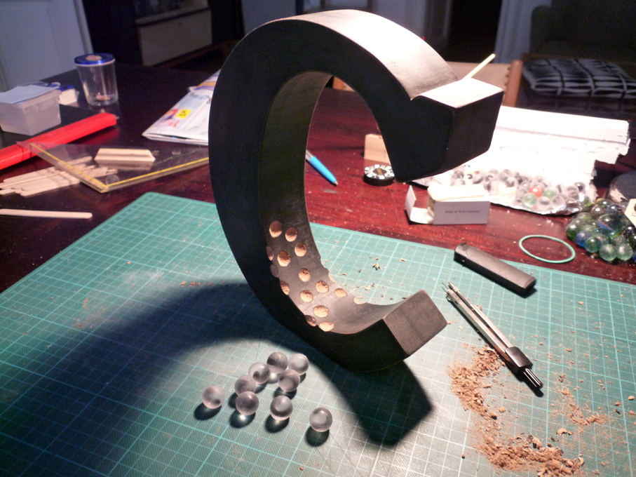
 This series in my project "Evolution of Type" is about the birth of letters. I chose A, B, C, the first letters of the alphabet, representative for all. "A" is completely made out of wood, "B" consists of wood and polymer clay. "C" carries spawn made out of polyester glass casting resin. I wanted each translucent egg to carry a little "c" inside, so I built a silicone mold around glass marbles. After the mold hardended, I took out the marbles and I filled the lower half of the mold with resin and placed the "c"s on the hemispheres. Then I closed the mold with the upper half and topped it up with resin. The finished eggs did not need to be polished - the cold glaze finish made them shiny. It is a bit tricky (and sticky) to work with all this synthetics and patience is needed. But the results are worth the effort. See the whole series on Behance.


Dienstag, 4. September 2012

Letter Fossils


I remember that in primary school we tinkered "our own fossil" with gypsum, leaves and twigs. With a little bit of technical refinement I managed to recreate fossilized letters for the ongoing project "Evolution of Type". Basically all it takes is much plasticine as a mold, a flat wooden letter, some stones for the fossil´s surface and some chicken bones. Here is the whole project.


Sonntag, 19. August 2012

Letterplay


With some cardboard left and the acrylics sitting on the shelf, I drew a picture of 2 "speechbubbling" letters. Of course, one letter would speak one letter. In the end this one letter conversation results in some sense. And as it goes, what started with one picture ended with four ideas. See this project here.


Donnerstag, 16. August 2012

DIY "business" cards


Tons of little old black & white photographs from the flea market plus a custom made rubber stamp: My new business cards. I deliberately chose "boring" landscape pictures roughly the size of a modern business card. The pictures show unspectacular scenery but yet must have been of some importance for the triggering photographer at a certain moment. Maybe the person identified the bad pictures but at these times a photo was too precious a thing to throw away. Now they slide into a second life.

Sonntag, 29. Juli 2012

Typoholic


I have the honor to be featured in the wonderful book "Typoholic". The publisher "viction:ary" presents part of my work on 6 pages. My letters can be seen next to a number of excellent pieces of work from top creatives that makes this book a hub for inspiration and well worth a look. Available here and in good book stores.


Mittwoch, 16. Mai 2012

A Pulse


The "Evolution of Type" goes mechanical. This time, instead of performing letter surgery, I simulate the heartbeat of a letter. Exhibit "A Pulse" consists of a plywood case, an electric motor powered by a rechargeable 12 V battery, some gears and an overall latex cover. The tricky part was the precise installment of the push rod. No need to do do this but I just had to paint the heart in red. See the project in my Behance portfolio.


Montag, 2. April 2012

Exhibits 15, 18, 21


After a while of widening the "Evolution" with a couple of experiments in sculpting, I decided to go back to the roots with these three exhibits. D, L and U are three steps further towards the full alphabet. To see the full range up until now visit my Behance portfolio.


Sonntag, 26. Februar 2012

Metamorphosis


In the course of time letters underwent many stages of progression towards the forms currently known. Why not suggest organic origin and, in this case, amphibious derivation?

 For "Evolution of Type, Exhibit 17 and 19" I fell back on my earlier print "Evolution of Type, Fig. 1-6", where I charted up the idea of a "metamorphing" letter A. The goal now was to sculpture this evolutionary process in a way a museum would display it. I created several stages of letter evolution from wood, twigs, dry leaves, paper and polymer clay and cast them in clear resin blocks. The results are two "fontological" showpieces. See detailed images.


Sonntag, 8. Januar 2012

Exhibit Nr. 14


59 Ms in different fonts in total, some really small. An old wooden showcase which had to be renovated. Translating font names into Latin. Delicate hand lettering and carefully driving needles through balsa wood letters. That´s what it took for "Exhibit Nr. 14" of my ongoing project "Evolution of Type". In this project I suggest letters to be of organic origin. In this anthropological approach collecting, classifying and displaying letters like insects similar to biological taxonomy brings the physical letter back on the table - a letter that has already dispersed into digital anonymity.

There is a wonderful article about my work on Meghan Killeen´s Cool Hunting blog:
http://www.coolhunting.com/design/andreas-scheiger.php


Sonntag, 1. Januar 2012

Albino "Z"


Present for a friend and a premiere in white: A remake of the original Exhibit Nr. 2. Friends asked me to craft colored letters for a change but I think that a letter´s "natural color" is black. Inverting black into white might be justified but I still think this is a derivative.