Dienstag, 22. November 2011

Amber


Amber - nature´s most spectacular way to preserve its ancient creatures for millions of years. Insects or plants get caught on the sticky surface of fresh resin and are fully inclosed by additional flow. After millions of years of hardening, the resin becomes amber containing a perfectly intact inclusion. If letters were of organic origin they might have been trapped in tree resin too. During the age of digital print processing the letterpress letter became extinct - but we still can marvel at its amber inclusion.


Exhibit 16/1-9 of my project series "Evolution of Type" is my first experiment with polyester glass casting resin. It´s a sticky business and the form is half the win. I cut some letters, then covered a stone in plasticine, took the stone out and used the plasticine as a mold. Working with polyester glass resin is tricky when it comes to coloring, timing and calculating the amount of hardener. Since the liquid resin is a yellowish substance - which gets clear while hardening - it is hard to estimate how much color to mix in. While adding more hardener speeds up the hardening process this heats up the casting block considerably which in turn might result in a cracked piece. I guess everyone working with this material had to learn some lesson. I deliberately included some air bubbles, bread crumbs and pepper in the liquid resin to make it look like natural amber. Check out the whole project on http://www.behance.net/andreasscheiger

Mittwoch, 16. November 2011

CR and GD


Two friends asked me to craft a present for their respective wedding anniversary. I simply combined the initials of the couples´given names while trying to maintain the character of one single letter.

4 pages in Zeixs


Proudly announcing my inclusion in Zeixs´ popular cube book series "New Typography 2". A great showcase of experimental typography by great graphic designers you might have stumbled upon in the net. Get the book here.

Sonntag, 15. Mai 2011

Making of Exhibits 10, 11 & 13


Once again I forgot to shoot more Making Ofs. Since I work on objects simultaneously I am just too caught up in the process. The "E" made of veins gave me the hardest time ever! The veins broke, they bent, they did not attach - they were unforgiving. The final version was the third try. I never had to throw away 2 failures before. Check out the completed project on: http://www.behance.net/andreasscheiger

Dienstag, 19. April 2011

Hot Off the Press


"Die Presse", one of Austria´s leading newspapers, features 3 of my works in their "Schaufenster Edition 2011". Each year "Die Presse" portrays a small selection of upcoming Austrian artists. On 14th of April the edition was presented to the audience at Lisabird´s Art Collective. What a party! In addition "Die Presse" offers limited edition art prints signed and numbered by the artists. Get your wonderful print here >

Mittwoch, 9. März 2011

The evolution starts here


For the sake of completeness: The first step of creating a letter for my series "Evolution of Type" is the most joyful one. The exposure of the skeleton. Mmmh...

Sonntag, 20. Februar 2011

Shooting the Letters

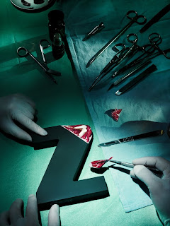
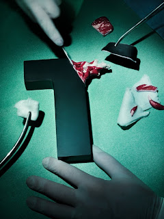
In October 2010 we gathered in Susanne Stemmer´s studio in order to take pictures of my letters. The plan was to simulate dissection in a surgery room. Weeks before I organized surgical instruments and garment but the hardest part was grabbing a time slot in Susanne´s busy work life.


There is nothing like a Hasselblad. And there is no one better then famous fashion photographer Susanne Stemmer. You already could see on the rigging that these are going to be kick ass pictures.


Catherine volunteered as model. Since we we did not know how much body and face will be shown on the pictures I had her and Felix dressed up completely in surgery apparel. I think that usually models don´t like that kind of garment but Catherine went along happily.

I did not see this coming: Latex gloves come in different sizes and I must have grabbed the XL - too big for Catherine. We had to tape and tacker.

Last facial touch ups and letters wiped clean.

It took considerate efforts to put all components in the right place. But here they are: four heroes in action.


The whole situation resembled a real surgery. I actually had to wipe foreheads.


Surgical intervention over. Can somebody please clean up the mess?

The studio team:
Felix Leutner, Catherine Hera Arming - Chief Physicians
Susanne Stemmer - Photographer
Andreas Scheiger - Idea & Patient Provider
Love you, folks!

Evolution of Type, Exhibits 1-9


The final result of a joyful project. All pictures were taken by Susanne Stemmer at her studio and retouched by Nicoletta Sobotta at her "Retoucherie". For more pictures see my Behance portfolio.

Samstag, 19. Februar 2011

Evolution of Type, Exhibits 6-9 & 12


The finished next set of letters. This time I used corals and shells in addition to chicken bones. For a full description and more pictures see my Behance portfolio.

Making of "Exhibit 6-9 & 12"


Materials: Powder-coated MDF, polymer clay, chicken bones, corals and shells, thread, wire, hot glue. Colored with acrylics, spray paint and clear varnish. I am so caught up in the process that I forget to shoot making-ofs. That´s why not all of my letters are documented here.

Mittwoch, 16. Februar 2011

Evolution of Type, Fig. 18


I plan to put this concept into a sculpture. I am still checking the details and testing materials and I already know it´s going to be a toughy.